2012
3rd Workshop on Complex Networks
The Art of Networks Exhibition
(click on the pictures for more information about the works)

We live in a data-driven environment, where data are collected and shared uninterruptedly: from traces left by our daily interactions with digital devices to the numbers routinely released by governmental agencies all over the world. Focusing on the complexity of relations within vast datasets the network sciences have provided insight into some governing principles of physical, biological, and social phenomena. Among the tools used to examine different network models and topologies are data visualizations, aiding to the understanding of complexity. In general, data visualizations can help us make sense of the data deluge by structuring data in ways that facilitate detection of patterns and trends, and ultimately, transform data into meaningful information.
The Art of Networks brings together ten visualizations representing networks in
topics as diverse as migration flows, speech cognition, citations, the spreading of social messages, and housing issues in the U.S. The authors are representative of top visualization groups around the world who are producing some of the most innovative work in this
area. The selected visualizations can literally open new ways of seeing and understanding relationships in the surrounding world.

Pulse of the Nation examines U.S. mood throughout the day inferred from over 300 million tweets. We observe interesting trends such as daily variations, with early mornings and late evenings having the highest level of happy tweets, and geographic variations, with the west coast showing happier tweets in a pattern that is consistently three hours behind the east coast.
Alan Mislove, Sune Lehmann, Yong-Yeol Ahn, Jukka-Pekka Onnela, J. Niels Rosenquist, Northeastern Univ., Harvard Univ. (U.S., 2011)
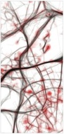
Traffic in Lisbon is a series of animations of traffic’s evolution in Lisbon during a fictitious 24-hour period (from 0:00 to 23:59). The project maps 1534 vehicles, during October 2009 in Lisbon, leaving route trails and condensed in one single day. The three animations presented here explore the visual metaphor of an organism with circulatory problems.
Pedro Cruz, Penousal Machado, João Bicker, University of Coimbra / FBA, CityMotion Project (Portugal, 2010)
Cascade allows for precise analysis of the structures underlying the sharing activity on the web. The tool links browsing behavior on a site to sharing activity to construct a detailed picture of how information propagates through the social media space. It is presented here in its initial application to The New York Times stories and information showing how its messages are shared.
Jer Thorp & Mark Hansen, The New York Times R&D Group (U.S., 2011)
The Stanford Dissertation Browser is an experimental interface for document collections. Stanford’s PhD dissertation abstracts from 1993-2008 are presented through the lens of a text model that distills high-level similarity and word usage patterns in the data. Each department is a circle colored by school and sized by the number of PhD students graduating from that department.
Jason Chuang, Daniel Ramage, Christopher Manning, Jeff Heer, Stanford University (U.S., 2009)
About 3% of the world’s population does not live in their native countries, including those that can be classified as refugees or asylum seekers. PeopleMovin is an effective interactive flow graph that highlights all these migration patterns in the world as of the year 2010 in one single view. The data used in the projects come from the World Bank (for the migration flows) and the U.S. Census Bureau (for the population) open datasets.
Carlo Zapponi (Italy, 2011)
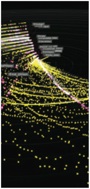
The graphic plots U.S. federal agency spending in 2009 against media coverage of those agencies in the same year. Each agency is represented by a stripe proportional to its budget presence. The graphic reveals that there is a dramatic mismatch between what our taxes fund and which issues occupy national discourse. It is clear for example,
that defense spending accounts for the majority of our federal budget‚ almost 70%.
Wesley Grubbs, Pitch Interactive (U.S., 2010)
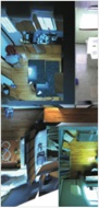
HouseFly is a data browsing tool being developed to help researchers navigate large collections of multi-camera video recordings. It combines video into dynamic 3D model of a recorded environment, in this case, a family home. HouseFly incorporates speech transcripts, person tracks, and other forms of data in an effort to uncover some of the unseen patterns of everyday life
Philip DeCamp & Deb Roy. Cognitive Machines group. MIT Media Lab (U.S., 2011)
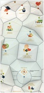
2015 Milan Universal Exposition is a visualization of the exhibition’s main theme and sub-themes. Every theme category is represented by a specific color, which is reflected in the hub and satellite nodes.
DensityDesign Research Lab, Politecnico di Milano: Paolo Ciuccarelli (Scientific Coodinator), Michele Mauri (Project Leader), Giorgio Caviglia, Lorenzo Fernandez, Luca Masud, Mario Porpora, Donato Ricci (Team); Gloria Zavatta (Theme development) (Italy, 2011)

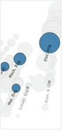
Ghost Counties shows U.S. Census 2010 housing data for all counties by state. Each bubble represents a county, where the size of the outer bubble represents the total number of homes and the inner bubble represents the vacant number of homes. The visualization reveals some interesting insights, such as counties that have more homes than people, or counties that have more than 50% vacant homes.
Jan Willem Tulp (The Netherlands, 2011)
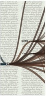
Citeology looks at the relationships between research publications through their use of citations. In total, 11,699 citations were made from one article to another within the collection of 3,502 papers published at the CHI and UIST Human Computer Interaction (HCI) conferences between 1982–2010.
Justin Matejka, Tovi Grossman, and George Fitzmaurice, Autodesk Research (Canada, 2011)
Important Dates
Workshop
March 7-9, 2012
Foosaner Exhibition on
“The Art of Networks”
March 8, 2012
The Art of Networks was organized by Isabel Meirelles, information designer and Associate Professor at Northeastern University, in collaboration with Carla Funk, Director of University Museums, and Jackie Borsanyi, Curator of Exhibitions, at the Foosaner Art Museum, Florida Institute of Technology. The exhibition was envisioned together with Ronaldo Menezes, Associate Professor at Florida Institute of Technology, for occasion
of the 3rd Workshop on Complex Networks, CompleNet 2012, hosted by the Department of Computer Sciences, Florida Institute
of Technology , Melbourne, Florida.
The Art of Networks wouldn’t be possible without the generosity of all the authors who are participating in this special exhibition at the Foosaner Art Museum, Florida Institute of Technology.